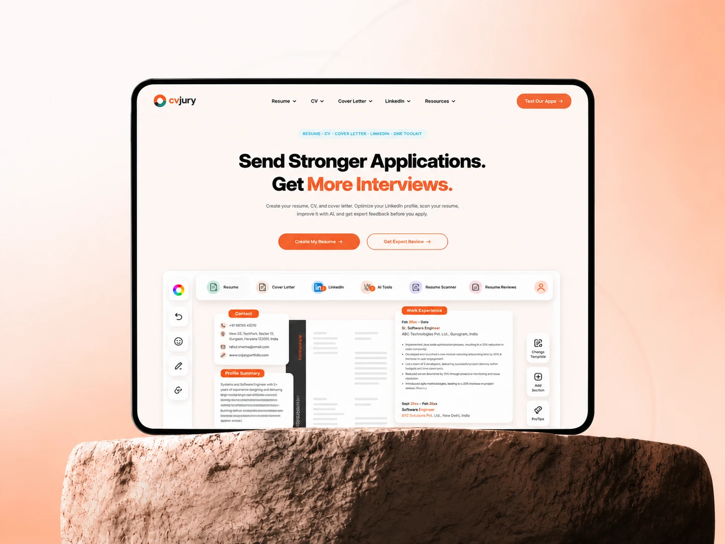
Project overview
CVJury is a UK-based career platform that helps job seekers build ATS-friendly resumes, optimize LinkedIn profiles, generate cover letters, and access career resources.
The existing website had evolved over time into a content-heavy experience. While the information was valuable, it was difficult for users to quickly understand the platform or navigate to the right services.
My goal was to redesign the experience without sacrificing the content that contributed to the site's SEO performance.
Drag to compare
The previous landing page against the redesigned one. Same content strategy underneath — a completely different experience on top.


Drag the handle left or right to reveal the old and new pages — the full landing page, top to bottom. Arrow keys work too.
Three problems to solve at once
Content overload
Years of accumulated content made the homepage overwhelming and difficult to scan.
Navigation
Users had no clear journey to discover services or understand the platform quickly.
SEO constraints
The client wanted to retain most of the existing content to preserve search rankings, limiting how much could be removed.
My approach
Rather than removing content, I focused on restructuring it. I introduced a clearer visual hierarchy, grouped related information, improved navigation, strengthened calls-to-action, and created a more modern design system that made the experience easier to scan while keeping SEO-critical content intact.
The result was a cleaner interface that balanced business requirements with usability.
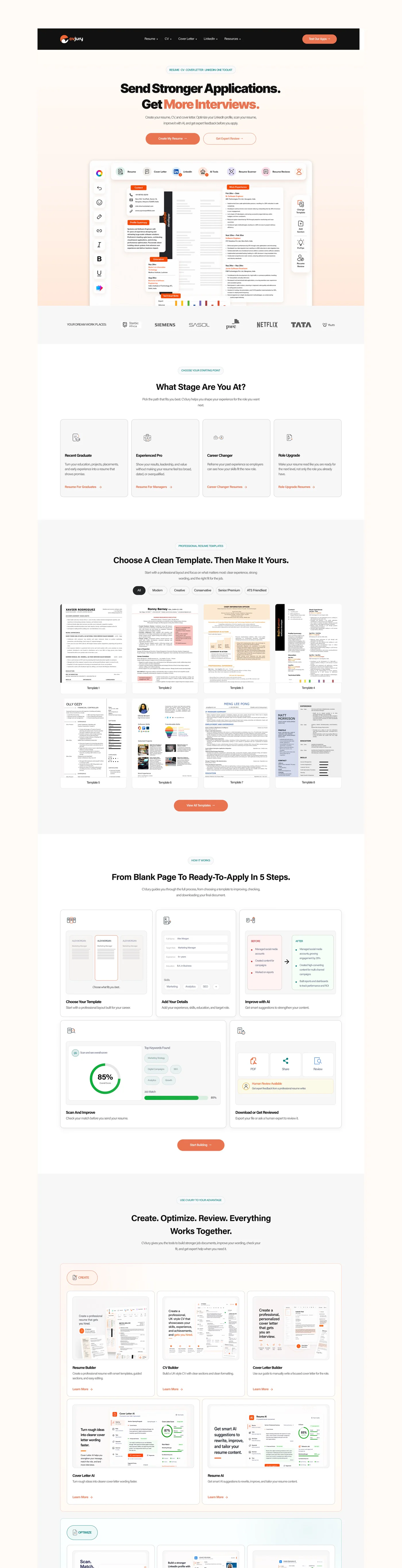
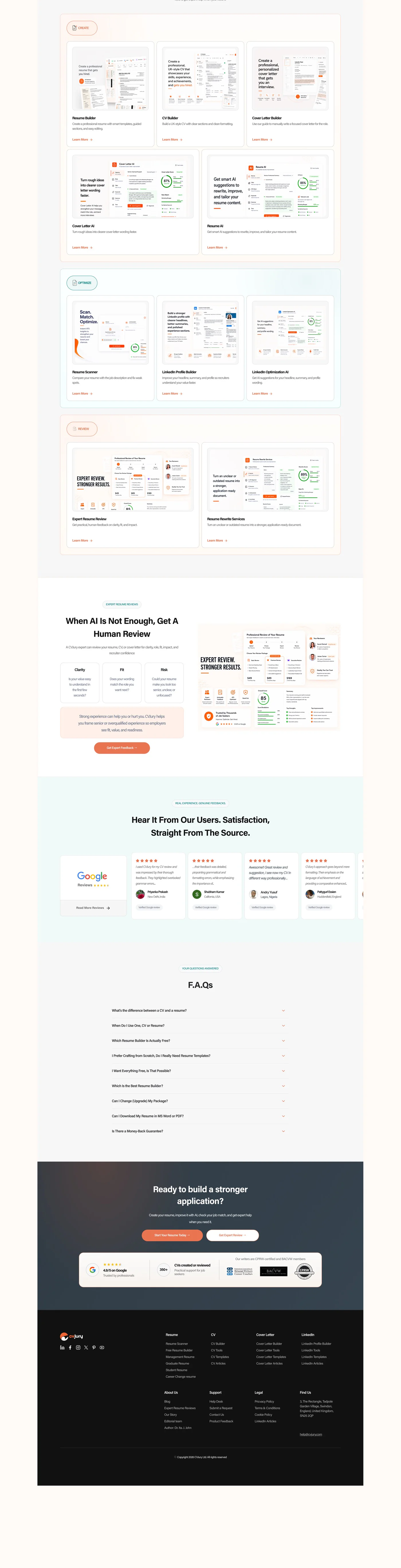
Redesigned homepage, top to bottom.
What changed
- Dense content
- Unclear navigation
- Competing CTAs
- Inconsistent spacing
- Hard to scan
- Clear visual hierarchy
- Simplified navigation
- More intentional conversion paths
- Consistent design system
- Easier to explore
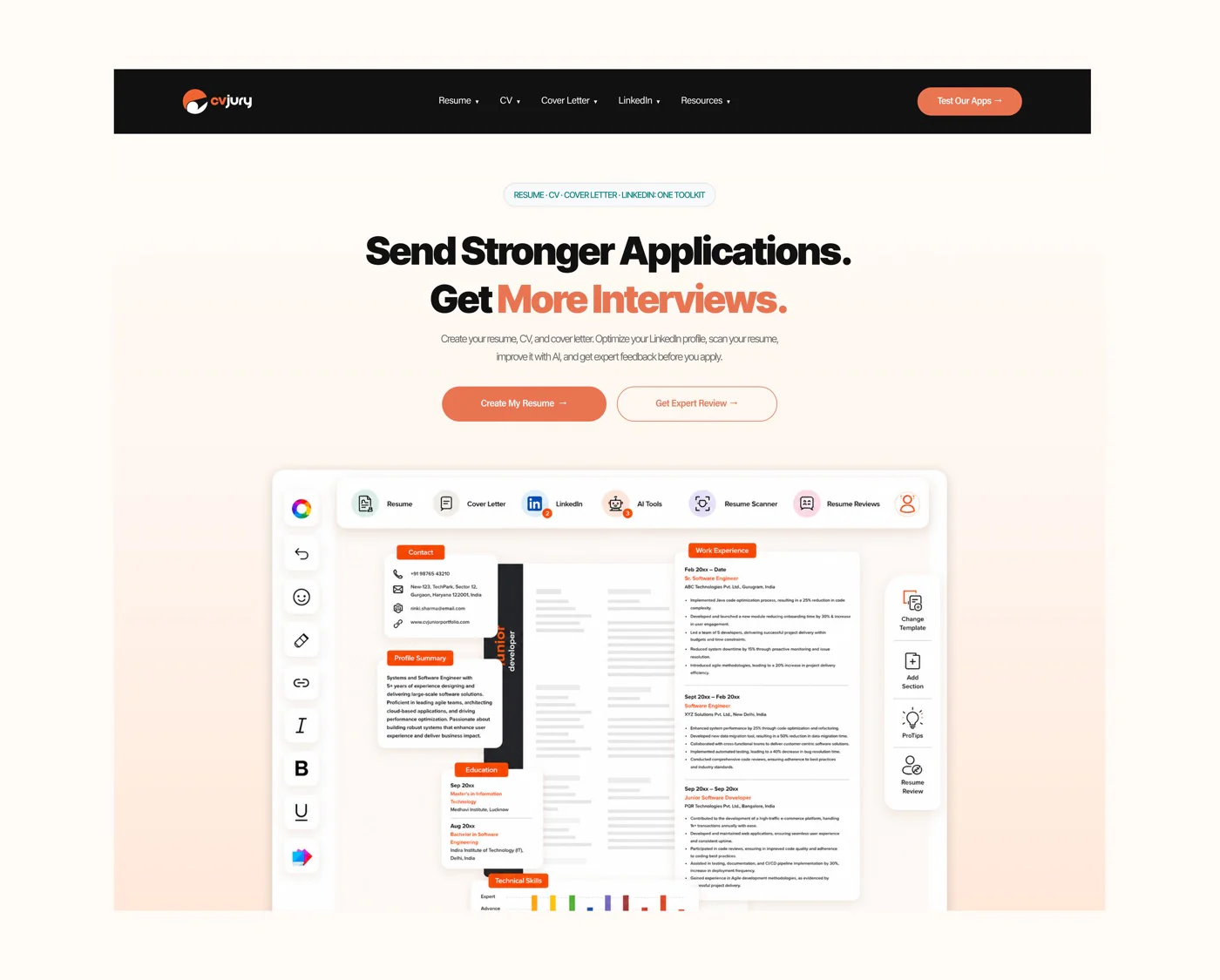
The refined visual direction, set by the hero.
Approved and in implementation
The redesign was approved by the client and is currently being implemented by the development team. By reorganizing — not removing — content, the project achieved a more modern, trustworthy, and conversion-focused experience while respecting the client's SEO requirements.
See it for yourself
Note: This case study focuses on the landing page redesign. Additional pages (32) were also redesigned as part of the project and can be explored using the live preview above.