GradPath
I built a product to make the graduate-school application journey less fragmented.
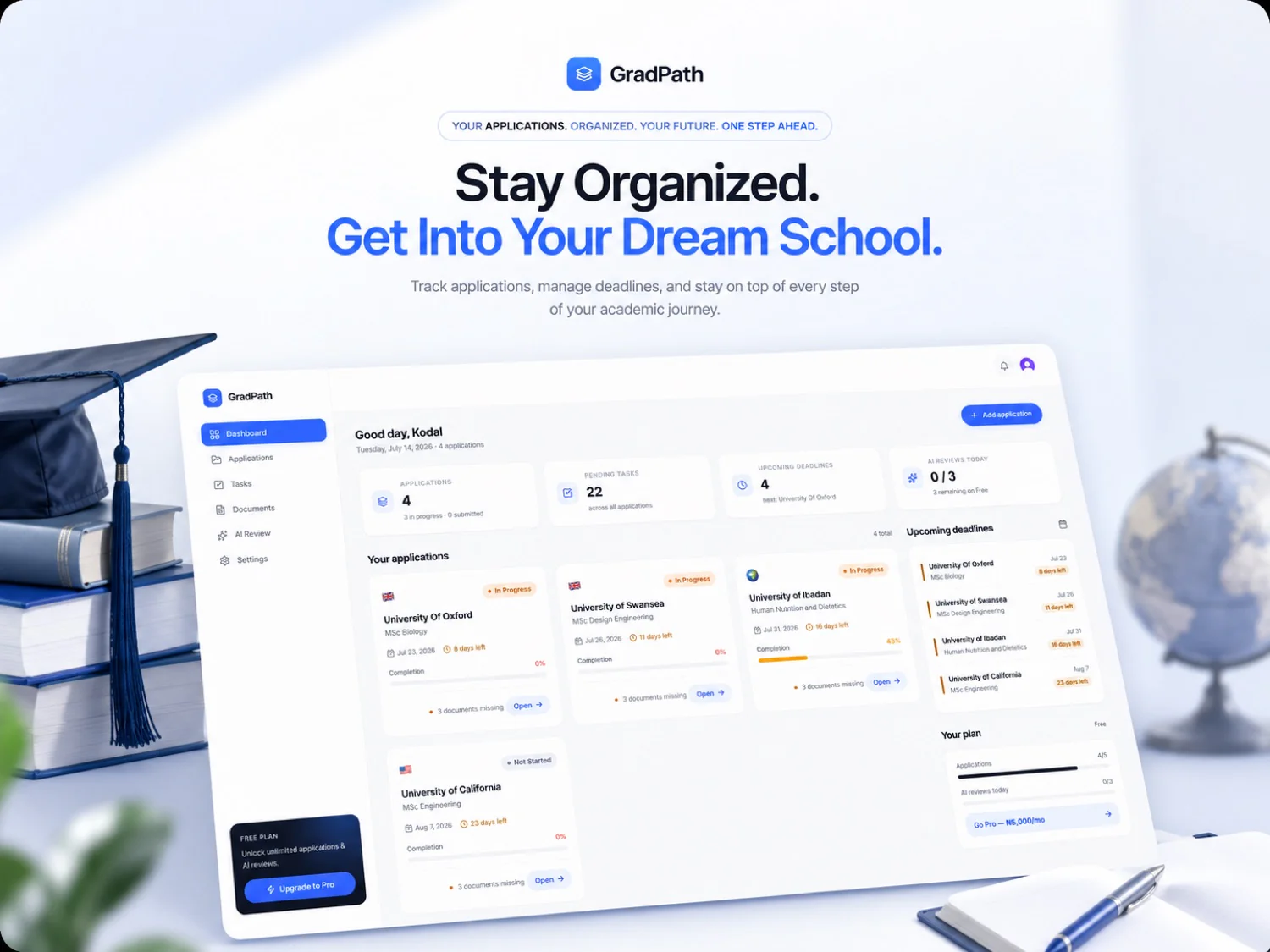
GradPath is an all-in-one graduate-school application companion — it helps applicants discover programs and funding, organise requirements and documents, manage deadlines, and use AI to improve their applications.
I founded and built GradPath from the initial product hypothesis through research, product strategy, UX/UI, engineering, launch, and iteration. This case study is the story of a hypothesis that research disproved, and what I did about it.
The graduate application journey is spread across a dozen tools.
Applicants don't struggle because any single step is hard. They struggle because the journey is fragmented across tools that don't know about each other:
There is no single place connecting these activities. That gap was the opportunity behind GradPath — and the starting hypothesis I would later have to revise.
Founder and Product Engineer — end to end.
I didn't join a product. I identified the problem, validated it, decided what to build, designed it, engineered it, launched it, and iterated on it.
Product
Problem definition · product vision · MVP scope · feature prioritisation · competitive analysis · roadmap · monetization strategy
Research
User research · survey design · feedback analysis · validation of product assumptions
Design
Information architecture · user flows · UX/UI · responsive & mobile · onboarding · interaction design · design system
Engineering
Product architecture · frontend · backend · database · authentication · API and integration work · deployment · iteration
Growth
Early user acquisition · feedback loops · email communication · product iteration from evidence
What that changes
No handoff, no translation loss. A research finding on Monday can be a shipped product decision the same week.
"Graduate applicants need a better way to organise and track the application process."
My original assumption was that the biggest problem was keeping track — of universities, programs, requirements, deadlines, and application status. So V1 was, deliberately, an application tracker built to reduce organisational overhead.
Create application
Add requirements
Track deadlines
Update status
Monitor progress
What V1 actually shipped
Every screen reads live, Prisma-backed application data — no placeholder content, no static mockups.
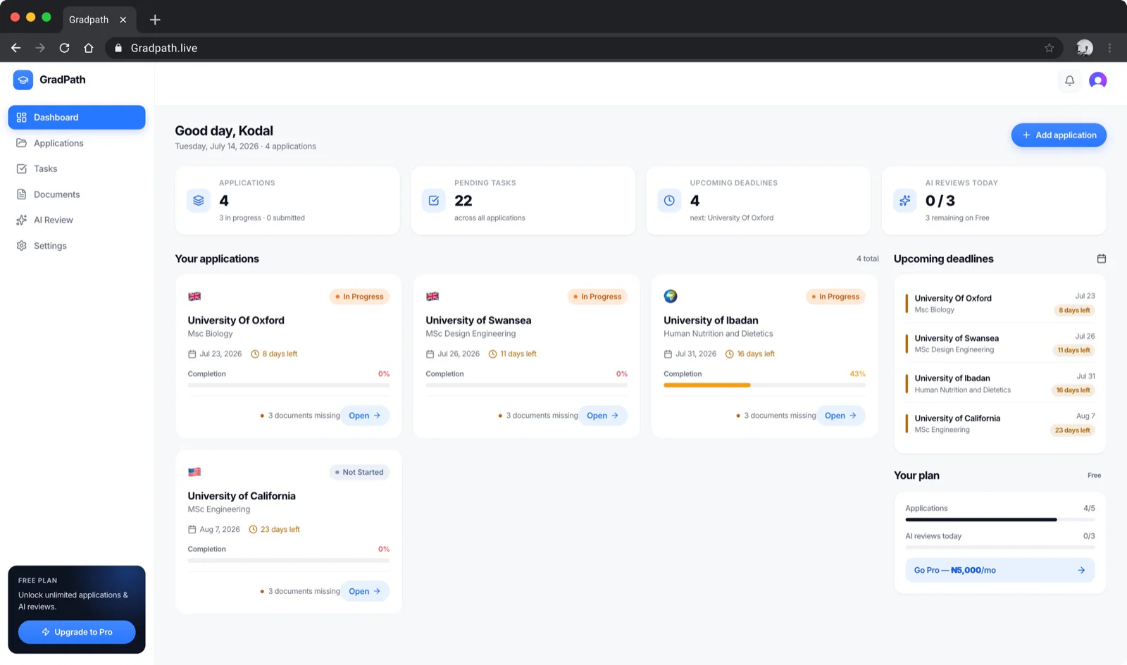
Dashboard
The command centre — active applications, upcoming deadlines, and overall progress surfaced at a glance, so the most important information comes forward instead of being searched for.
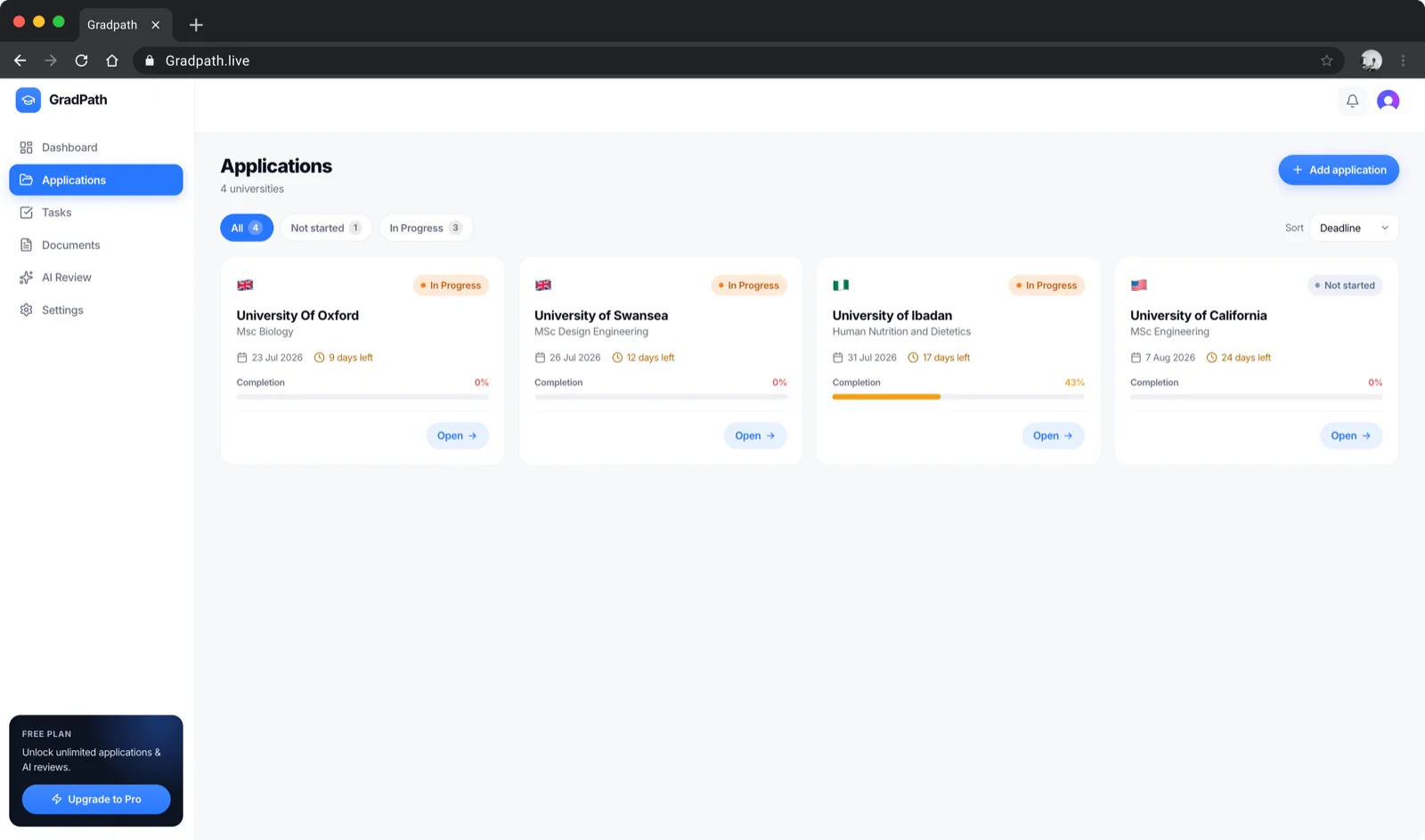
Applications
The core workspace. Create, organise, and monitor multiple university applications, each a centralised record holding its own progress, requirements, and supporting information.
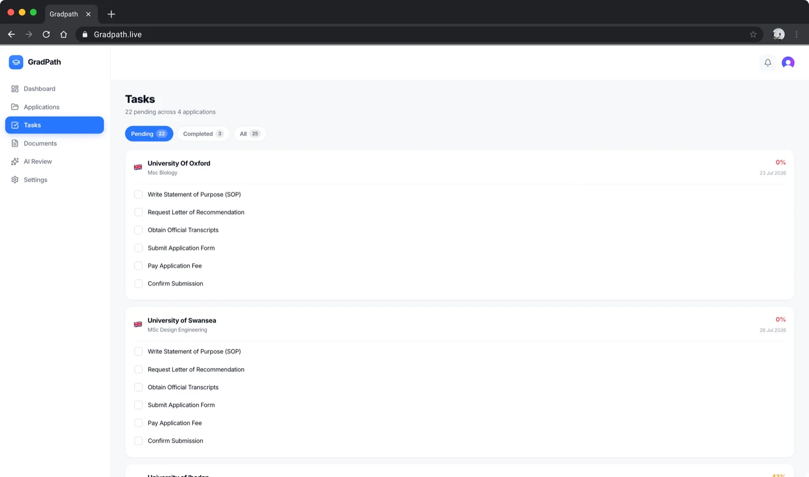
Tasks
Each application auto-generates its checklist — request references, upload transcripts, write the statement, pay the fee — breaking a large application into steps with clear visibility into what's still outstanding.
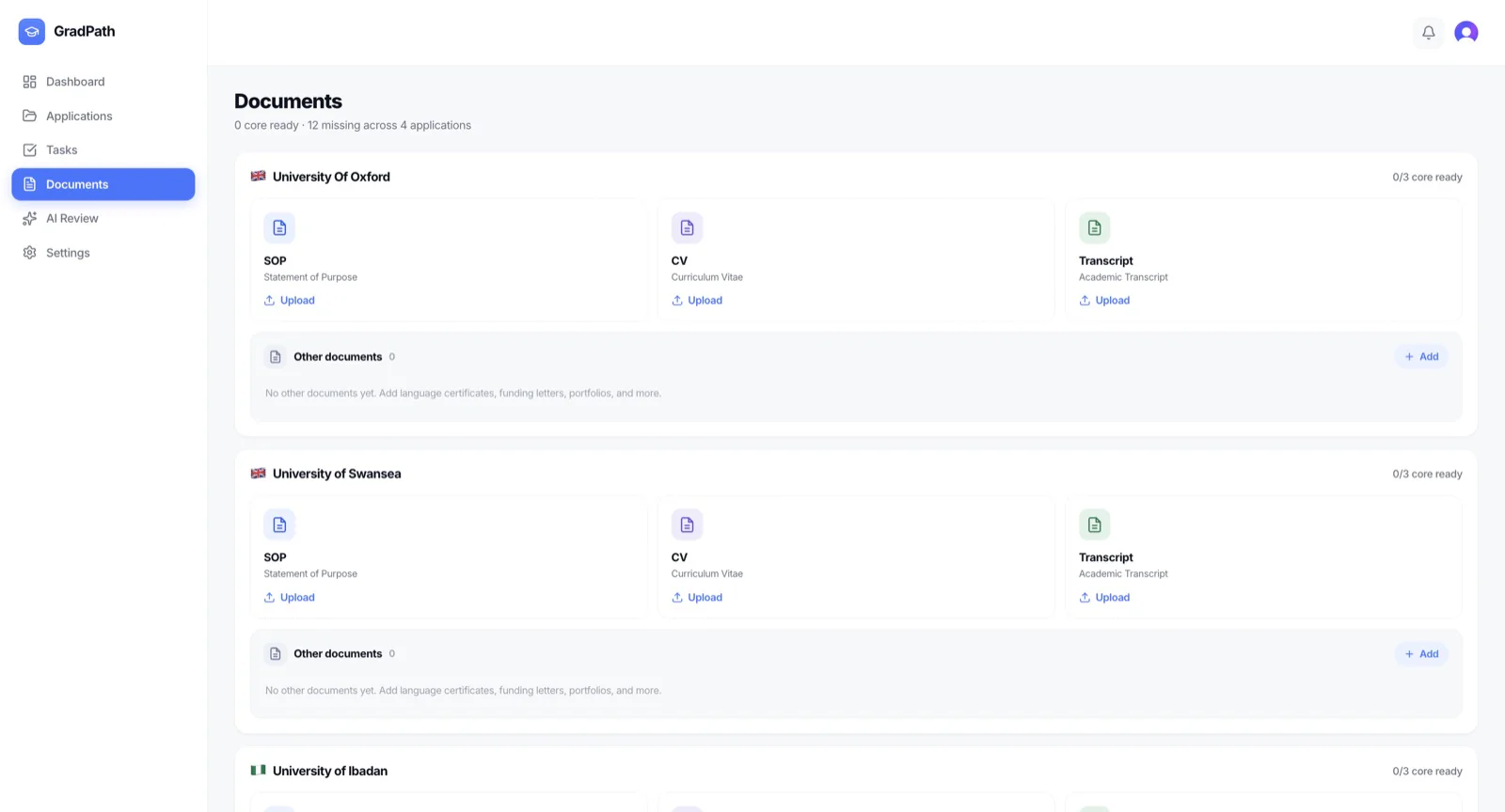
Documents
Supporting files live alongside their application, in Supabase storage, instead of scattered across cloud drives and download folders — less context switching, faster retrieval.
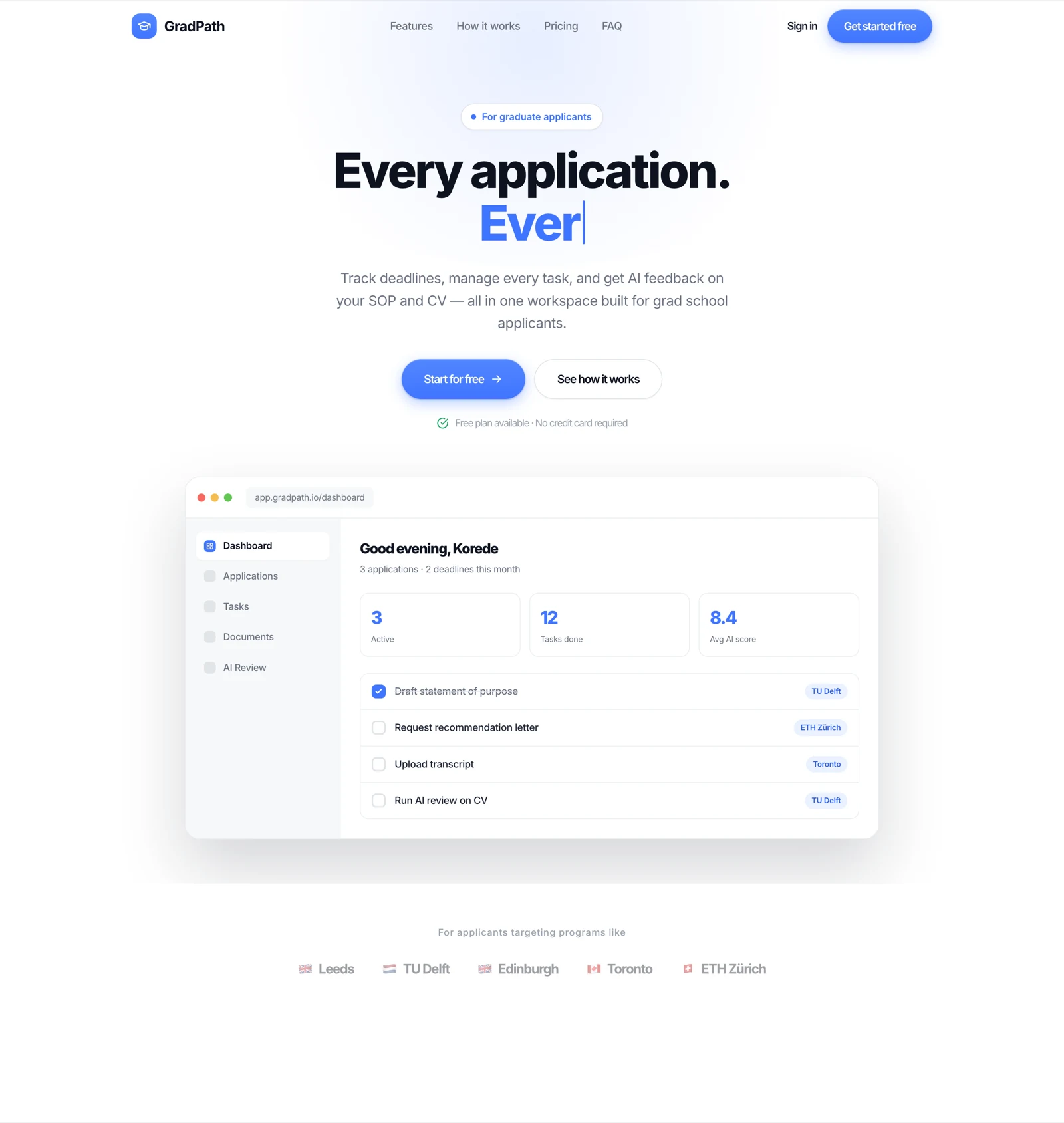
Landing page
A typing hero cycling through GradPath's core promises, an illustrated dashboard mock that animates its own task checklist, a feature grid, and a legally-clean trust row (see the engineering decisions below).
Then I put it in front of people.
I ran two studies: one with prospective applicants, one with people who had already signed up for GradPath.
These samples are small. Nothing below is statistically representative, and I don't present it that way. They are directional product signals — enough to challenge an assumption and redirect a roadmap, not enough to prove a market.
Who responded
Age
25–29: 9
30–35: 3
20–24: 1
Location
Ibadan: 8
Lagos: 4
Abeokuta: 1
Application stage
Actively preparing: 6
Currently in grad school: 4
Want to, haven't started: 3
On familiarity with the process, 4 described themselves as confident, 4 as average, and 5 as somewhat or completely lost. A meaningful portion of a small, self-selected group felt uncertain about how graduate applications work at all — worth noting, not worth overstating.
The biggest pain wasn't tracking applications.
I asked what applicants find hardest. The answer reordered my roadmap.
I built a tracker. Deadline tracking came fourth-most-mentioned behind funding. Funding discovery appeared substantially more often than the problem I had designed the entire product around. That single finding became the largest input into V2 strategy.
What people already do instead
Respondents described manual tracking, Google searches, university websites, and AI tools — ChatGPT, Claude, Gemini — with no dedicated solution tying them together. Applicants were already stitching together multiple tools to manage different parts of the journey.
That matters in two directions. It supports the opportunity — the workflow really is fragmented. And it sets a bar: an AI feature inside GradPath has to beat a general-purpose chatbot they already use for free. It isn't that no solution exists; it's that no connected one does.
Feedback from onboarded users
Five people who had already signed up for GradPath.
Usage depth
Just signed up / barely used: 3
Tried it a bit: 2
Using regularly: 0
Using for real applications: 0
What this can tell me
First impressions and early usability. Nothing about retention — nobody in this group had used GradPath for a real application yet.
A caveat I'm not hiding
One response appears to come from an alternate account belonging to me. The effective external sample is closer to 4.
Easy enough to navigate, not yet proven to retain
“The design itself makes the whole application process look less overwhelming😅, the website is very easy to navigate, love it.”
Study B respondent, anonymised“I love the fact that you added the free version even though it's limited… it feels fair, not like a bait and switch.”
Study B respondent, anonymisedThe bug that mattered more than it looked
“I just created an account but I am seeing applications I didn't make showing overdue.”
Study B respondent, anonymisedA new-user data/state issue caused placeholder or seeded applications to appear in a user's dashboard. The issue was identified through research and has since been fixed.
A second respondent reported not receiving a reminder in the days before an application went overdue — a reminder-reliability problem, also surfaced by research.
Neither of these is really a technical footnote. GradPath's core promise is helping someone stay on top of their applications. A phantom application, or a reminder that never arrives, attacks that promise directly — the product is telling the user something untrue about their own deadlines. Trust is a feature, and these were trust bugs.
They moved three things up the roadmap: correct new-user empty states, reliable reminder logic, and better first-session guidance.
What each signal actually changed
| Research signal | What I learned | Product response |
|---|---|---|
| Funding identified by 12/13 prospects | Funding is a bigger pain than I assumed | Prioritised Funding Discovery |
| SOP/CV support appeared 7/13 | Applicants need help preparing documents | Prioritised AI Document Review |
| Deadline tracking appeared 6/13 | Tracking still matters — it just isn't the only problem | Continue improving application tracking |
| Users requested scholarship matching | Generic scholarship lists aren't enough | Explore profile-based funding matching |
| Users requested deadline reminders | Reminders are valuable | Improve the reminder system |
| New users were unsure what to do next | First-session guidance was weak | Add onboarding walkthrough + contextual tooltips |
| A new user saw applications they didn't create | Data/state behaviour damaged trust | Fix new-user application state |
| Mobile usage is important | GradPath needs to feel natural on phones | Move toward mobile-first UX and bottom navigation |
| AI document review explicitly requested | AI assistance already fits user behaviour | Prioritise AI Review |
| Most respondents anchored at lower price bands | Pricing needs validation | Reconsider Pro pricing and packaging |
From tracker to companion
GradPath = Application Tracker
Applications, requirements, deadlines, status.
GradPath = Graduate Application Companion
Discover, decide, prepare, apply, improve, track.
The strategic question changed from "how do we track applications better?" to "how can GradPath help applicants navigate the entire graduate-school application journey?"
Discover
Find programs and funding.
Decide
Compare and understand fit.
Prepare
Organise requirements and documents.
Apply
Track applications and deadlines.
Improve
Use AI to strengthen materials.
Track
Monitor progress and decisions.
Funding discoveryIn development
The strongest recurring problem in the research becomes a first-class part of the product.
Discover
Filter
View
Save
Track
Apply
Opportunities can be matched against field of study, degree level, nationality, destination, eligibility, deadline, and funding type.
One rule shapes the whole feature: a wrong deadline is worse than no deadline. If someone's application depends on a date, showing a plausible-but-unverified one is actively harmful. So GradPath distinguishes confirmed information from information still awaiting verification, and shows the official source where it can. I'm not claiming every opportunity is automatically verified — that would be exactly the kind of promise this feature can't afford to break.
A maintained database, not a static list
Each opportunity is a structured record — name, provider, description, eligibility, nationality, degree level, field, destination, coverage, deadline, official application URL, official source, verification status, and last-verified date.
The long-term objective is a maintained funding database rather than a scholarship page that rots. Today that means admin/manual entry with verification metadata — honest about what it is. Automation is a later problem; correctness is the current one.
This is not an empty market
Competitors exist, and pretending otherwise would be a strategy error. One relevant reference is Bursa Scholar — a scholarship-first experience with strong funding discovery, AI-assisted interaction, a distinctive sidebar/navigation model, and an "Ask Bursa" assistant concept.
I treat it as reference material for underlying product patterns, not something to copy. The more useful conclusion is about positioning: GradPath should not become another scholarship directory. The opportunity sits at an intersection.
Scholarship-first products
Strong funding discovery. Less focused on the whole application lifecycle.
Application trackers
Strong application organisation. Less focused on funding discovery and AI assistance.
General AI tools
Flexible assistance. No structured application workflow or context.
Application management + Funding discovery + Documents + AI assistance
The strategic opportunity isn't having the most individual features. It's connecting the workflow.
Context is the thing that compounds
I'm deliberately not calling this a moat — it isn't one yet. Individual features can be replicated. What's harder to replicate is the context that connects them.
If a user tells GradPath "I'm applying for an MSc in Public Health in the UK," the product can, over time, understand their target degree, their applications, their deadlines, their documents, their funding eligibility, and their progress. Assistance grounded in that context can be far more useful than a blank chat window — which is the whole argument for building AI inside the workflow rather than beside it.
Teach without getting in the wayIn development
Research showed new users weren't sure what to do next. The fix isn't a long tutorial.
Add your first school
Add requirements
Track deadlines
Upload documents
Monitor status
A short first-session walkthrough, then contextual tooltips that appear the first time someone meets a feature. The design principle is deliberately restrained: teach without getting in the user's way.
From sidebar to bottom navigationIn development
V1's navigation was desktop-oriented — a sidebar. For V2 I'm moving to a bottom navigation pattern on mobile, because the sections people need most should be one thumb-reach away:
This is a product decision, not a visual refresh: it reduces navigation friction and makes the product feel native on the device most applicants actually use. It's a design direction informed by mobile usability considerations — not something I've validated at scale.
Meeting a behaviour that already exists
AI isn't in GradPath because AI is fashionable. Research showed applicants already use ChatGPT, Claude and Gemini — especially for writing and refining SOPs and CVs. The opportunity isn't to introduce a new behaviour; it's to connect an existing one to application context.
| Where AI helps | Example | Status |
|---|---|---|
| Discovery | "Find funding opportunities that fit my profile." | In development |
| Decision-making | "Which opportunity is more suitable for me?" | Long-term |
| Preparation | "What should I improve in my SOP?" | In development |
| Review | "Review my CV." | In development |
| Tracking | "What deadline is coming up next?" | Long-term |
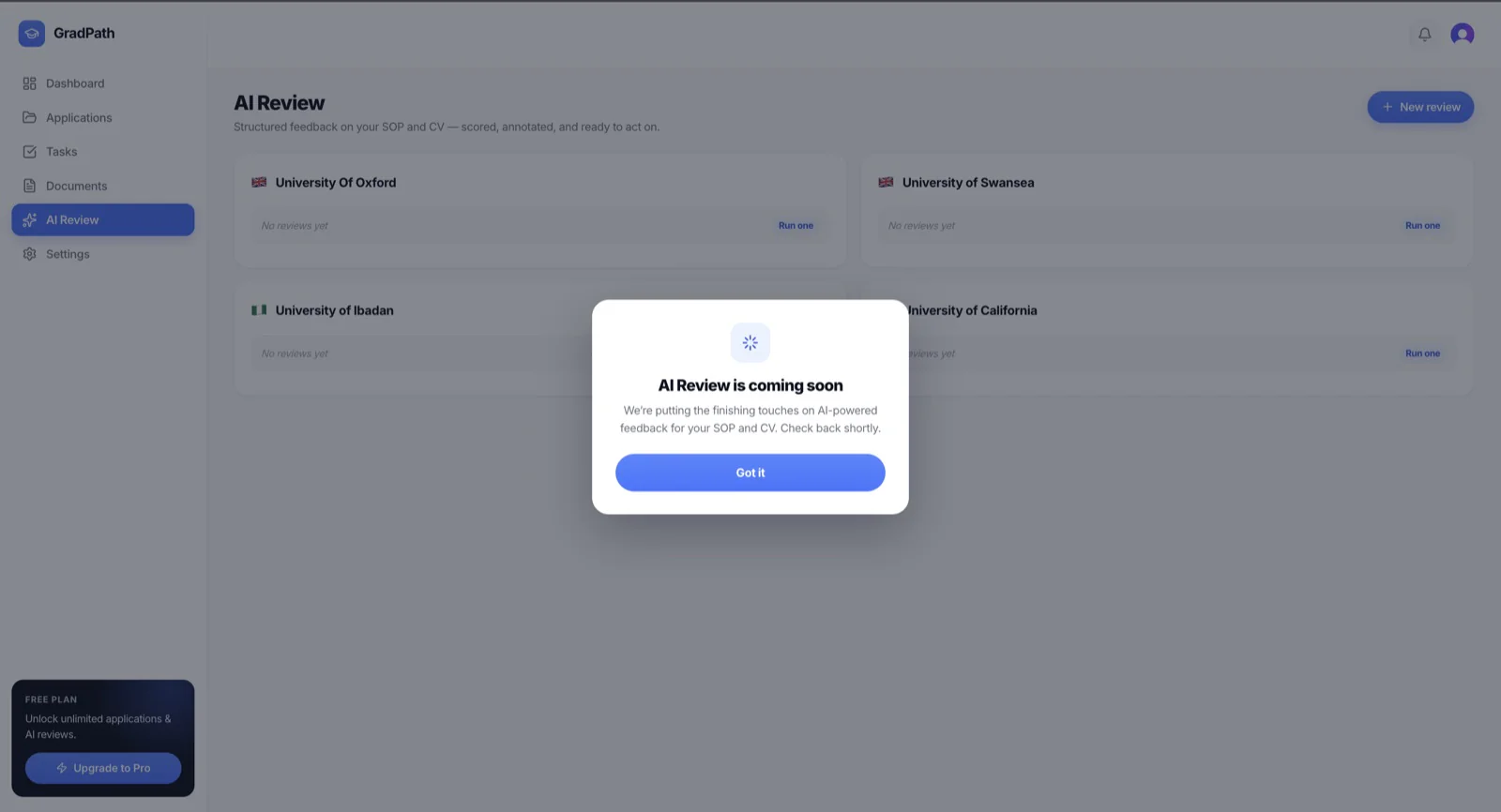
AI document reviewIn development
Users spend AI credits to review documents such as a CV or SOP. The review evaluates clarity, structure, relevance, consistency, weak sections, and areas for improvement.
The positioning matters: the AI should assist applicants rather than generate everything for them. The goal is a stronger application written by the applicant — not a generated one they can't defend in an interview.
Monetizing intelligence, not capacity
Charge for capacity
Free: maximum 5 applications. Pro: unlimited applications + AI features.
Charge for intelligence
Free: unlimited tracking, funding discovery, 75 AI credits/month. Pro: the same, with 250 AI credits/month.
The original assumption was straightforward: more applications = more value = users pay to unlock capacity. Competitive research and user feedback both challenged it. Competitors offer substantial application management for free, and capping the core workflow puts a paywall in front of the exact thing that makes the product useful.
Notably, the free tier itself tested well — one respondent called it "fair, not like a bait and switch." The problem wasn't having a free tier; it was which lever the limit was attached to. Charging for high-cost AI assistance rather than basic capacity keeps the core genuinely useful and puts the price on the part that actually costs money to run.
This is a hypothesis under test, not a validated model.
A lower price anchor — with heavy caveats
Study B split ₦1,000–₦5,000: 3, ₦6,000–₦10,000: 2, above ₦10,000: 0.
I'm treating all of this cautiously. The sample was small, respondents self-selected, the audience was connected to me, and stated willingness to pay is not payment. The honest reading is: the research suggests a lower price anchor, but real payment behaviour still needs to be validated. It is not evidence that users will only ever pay ₦1,000–₦5,000.
What this research cannot tell me
Sample and selection
- Study A = 13, Study B = 5 — directional signals, not statistically representative findings
- Participants opted into my research; Study A skewed toward Ibadan and my own design/technology network
- One Study B response appears to be an alternate account of mine — effective external sample ≈ 4
Instrument and scope
- Onboarded users had barely used the product — this measures first impressions, not retention
- Study A's pricing question wasn't gated, so respondents who said they wouldn't pay could still pick a band
- The 1–5 recommendation question is not NPS, and I don't calculate one from it
How it's actually built
The architectural rule is simple and enforced: the UI never touches the database directly.
UI
API
Database
API
UI
Built with Next.js and TypeScript, Tailwind for styling, Prisma over a Supabase Postgres database, Clerk for auth, Anthropic for AI review, Flutterwave for payments, and Vercel for hosting — with Figma and AI development tooling in the workflow.
Refusing to stop at the first plausible fix
Every page load was slow. The obvious culprit was redundant Prisma queries — each page called user.findUnique then application.findMany separately. Consolidating them into one nested query was a real improvement, but load times barely moved.
Rather than accept a partial win, I kept digging and found the actual root cause: Vercel's serverless functions were deployed in Washington D.C. while the Supabase database lived in Frankfurt, so every query made a transatlantic round trip no matter how well written. Moving the function region to Frankfurt fixed what query optimisation couldn't. The lesson generalised — a plausible fix that doesn't fully resolve the symptom is a signal to keep digging, not a place to stop.
Cost guardrails before feature polish
Before any public-facing polish, I verified free-tier limits were enforced server-side in the API routes, not as a UI restriction a technical user could bypass. AI review calls a paid API on my own credit, so an unenforced limit isn't hypothetical — it's uncapped cost exposure. The cap goes in before the feature reaches a user.
Product safety over a "cooler" landing page
An early landing direction called for real university crests in a "trusted by" row. I rejected it: displaying another institution's trademarked crest implies a partnership that doesn't exist — a legal risk, and a trust risk the moment a sharp user notices. The section was rebuilt with self-designed marks and national flags, honestly labelled ("for applicants targeting programs like…" rather than "trusted by").
Prototype before touching production
The landing redesign was built and iterated as a standalone HTML prototype first, reviewed several times, before a line of production code was touched. That caught an inconsistent accent colour, an off-brand button style, and a broken visual element while they cost nothing to fix.
Why founder + product engineer changes the work
Research → Design → Handoff → Engineering → Feedback
Every arrow is a translation, and a place for intent to leak.
Research → Decision → Design → Build → Test → Observe → Iterate
No handoff. The person who heard the finding ships the fix.
Concretely: research showed users weren't sure what to do next → I designed guided onboarding → implemented it with contextual tooltips → and can now observe first-session behaviour and refine. That loop closes in days, not planning cycles.
The loop that produced V2
Hypothesis
Application tracking is the biggest problem.
Research
13 prospects + 5 onboarded users.
Finding
Funding was the most reported pain.
Decision
Prioritise funding discovery.
Build
Structured opportunities, saving and tracking.
Next question
Will applicants return for funding discovery?
What actually changed
| V1 | V2 | Status |
|---|---|---|
| Application tracker | Application companion | Direction |
| Application-focused | Applications + funding | In development |
| 5-application free limit | Unlimited core applications | In development |
| Limited onboarding | Guided onboarding + tooltips | In development |
| Desktop-oriented, sidebar navigation | Mobile-first, bottom navigation | In development |
| AI as a planned premium feature | AI integrated into the workflow | In development |
| Basic document workflow | Document + AI review workflow | In development |
| Monetization around capacity | Monetization around AI assistance | Hypothesis |
What I'll measure
No usage, retention, or revenue results are claimed here — this is what I'm instrumenting for.
Activation
First application created · first funding opportunity viewed · first opportunity saved · first document uploaded · first AI interaction
Engagement
Applications managed · requirements completed · opportunities viewed and saved · documents reviewed · AI credits consumed
Retention
Weekly and monthly active users · repeat application activity
Monetization
AI credit usage · free → Pro conversion · Pro retention · revenue per paying user
The real question
Does GradPath become part of an applicant's actual graduate-school workflow?
What's live and what isn't
Live in V1
- Application management — create, organise, track
- Task checklists generated per application
- Document storage alongside each application
- Deadline tracking and account operations
- Fix shipped for the new-user application-state issue
In development
- Funding discovery and the structured opportunity database
- Unlimited core application tracking
- Guided onboarding and contextual tooltips
- Mobile-first bottom navigation
- AI assistance and AI document review
- Improved reminder reliability · free/Pro AI credit model
One place to navigate the journey
GradPath started as "a better way to track graduate applications." It's becoming "one place to navigate the graduate-school application journey."
Eventually someone should be able to arrive with "I want to go to graduate school" and move through explore → find programs → find funding → compare options → prepare documents → improve applications → track deadlines → submit → monitor decisions.
The goal isn't another application tracker. It's an intelligent companion for the whole journey.
What I learned
Your first hypothesis isn't necessarily the right one
I started with tracking. Research showed funding was the larger recurring pain — and I had built the product around the wrong centre.
Small research still exposes real problems
18 people can't prove a market. They were more than enough to surface a broken new-user state and a weak first session.
Free can be a strategic decision
Removing limits from the core workflow may reduce friction and increase adoption — the price belongs on the expensive part, not the useful part.
AI is more valuable with context
A generic chatbot is one tab away. An assistant that knows your applications, documents and funding goals is a different product.
Trust is part of UX
Phantom applications and missed reminders aren't just bugs. They tell the user something untrue about their own deadlines.
Founder + engineer changes how I build
I can go from identifying a problem to shipping a solution without a handoff — which is exactly how research turned into V2.
“The most interesting part of building GradPath hasn't been designing a dashboard. It has been discovering that the product I initially thought I needed to build wasn't necessarily the product users needed most.”
Founder reflectionI started with a tracker. Research challenged the assumption. Competitive research challenged the monetization model. Early users exposed onboarding and trust issues. Building it exposed technical constraints. Each iteration changed the product.
I'm not just designing GradPath. I'm building it.